
The short answer is that names and dates are rarely "printed on" a metal gift. They are built into the piece in one of a few ways, and which way you choose depends on where the text sits and how it should read at arm's length. On a flat recessed panel, the text is usually engraved or laser-marked into the surface. On a raised or curved face, it is more often cast into the mold itself, so the letters rise or sink with the relief. Neither is automatically better; they simply produce different looks, and the right one follows from the design rather than from a preference for one technique.
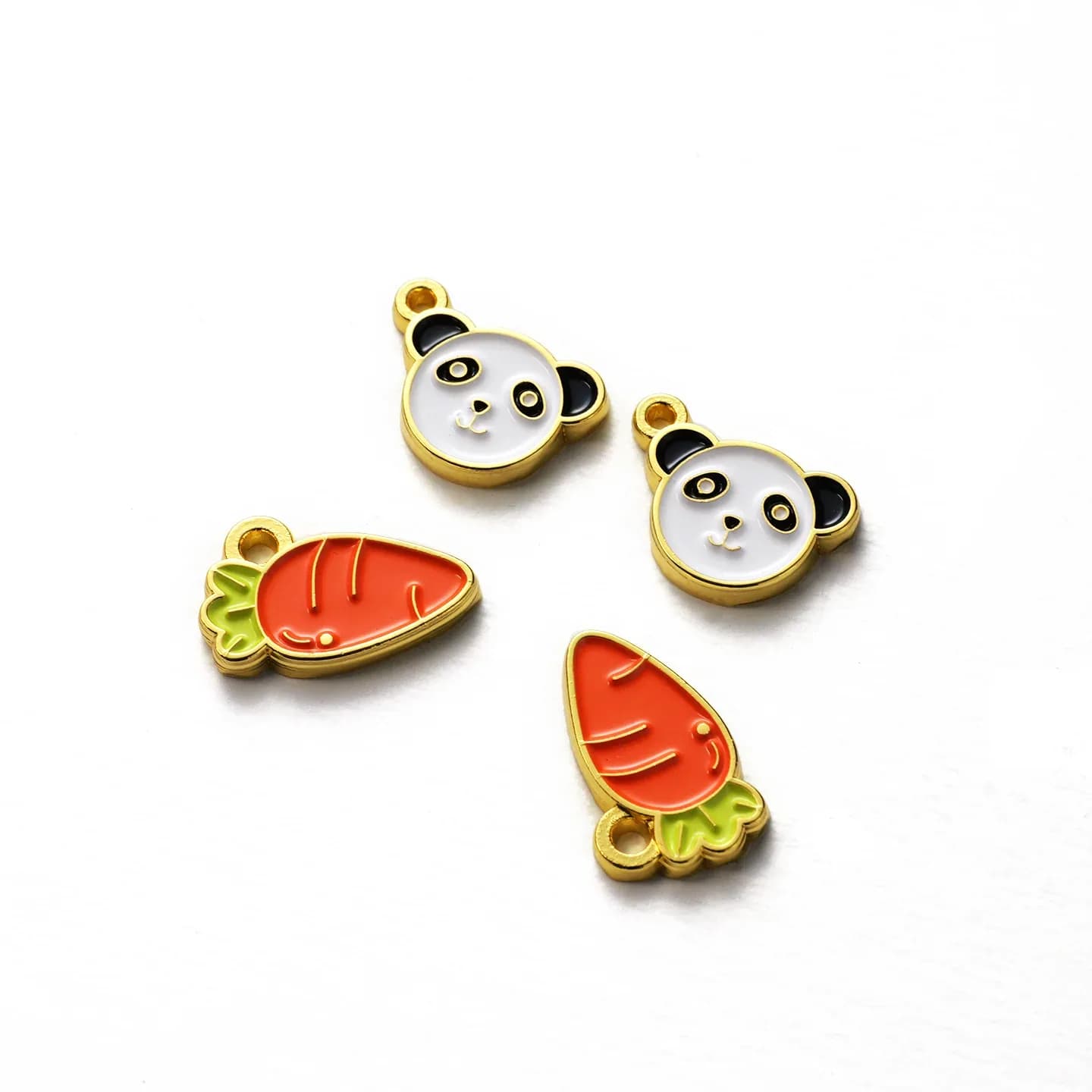
This matters because the same name can look crisp in one placement and cramped in another. Cast lettering has to be drawn into the tooling, so very small text or very fine serifs can fill in or blur once the metal is poured. Engraved text can go finer, but it cuts through the plating, which means the letter color is the raw metal underneath unless the piece is refinished afterward. If you want a name to read as a clean contrast against a gold or silver surface, that is a finishing question as much as a lettering one, and it is worth raising early rather than after the artwork is locked.
Dates deserve their own thought, because they are where personalization most often goes wrong. A full date written out takes far more space than a numeric one, and on a small medal or badge the difference can push the layout into the rim. Numeric dates are compact and read quickly, but they invite ambiguity across regions: 03/04 means different days in different countries. If the gift will travel, spelling the month or using an unambiguous format avoids a quiet embarrassment. It is also worth deciding whether the date is the event date, the founding date, or the date of the award, since a single line cannot carry all three without explanation.
Wording is the other half of the problem. A personalization line usually has room for a name and one short phrase, not a sentence. Long job titles, full company names, and honorifics compete for the same space, and the result is often text that has to shrink until it no longer matches the weight of the design around it. The practical move is to rank what must appear: the name first, then the date, then anything else only if the layout genuinely allows it. If a longer message matters, it usually belongs on the back or on the packaging rather than squeezed onto the face.
Where the text goes also changes how it is made. A name on the front of a commemorative medal sits inside the main relief and has to be composed with the artwork from the start. A name on the reverse can be a simpler engraved block, which is often the more economical place for individual personalization, especially when each recipient gets a different name. This is the point where variable data becomes a production question: if every piece carries a different name, the text cannot be cast into a shared mold, and the run shifts toward engraving or marking per piece. That affects both cost and lead time, so it is better decided before quoting than discovered afterward. Our guide to what actually drives the cost of custom metal gifts explains how tooling and per-piece work interact.
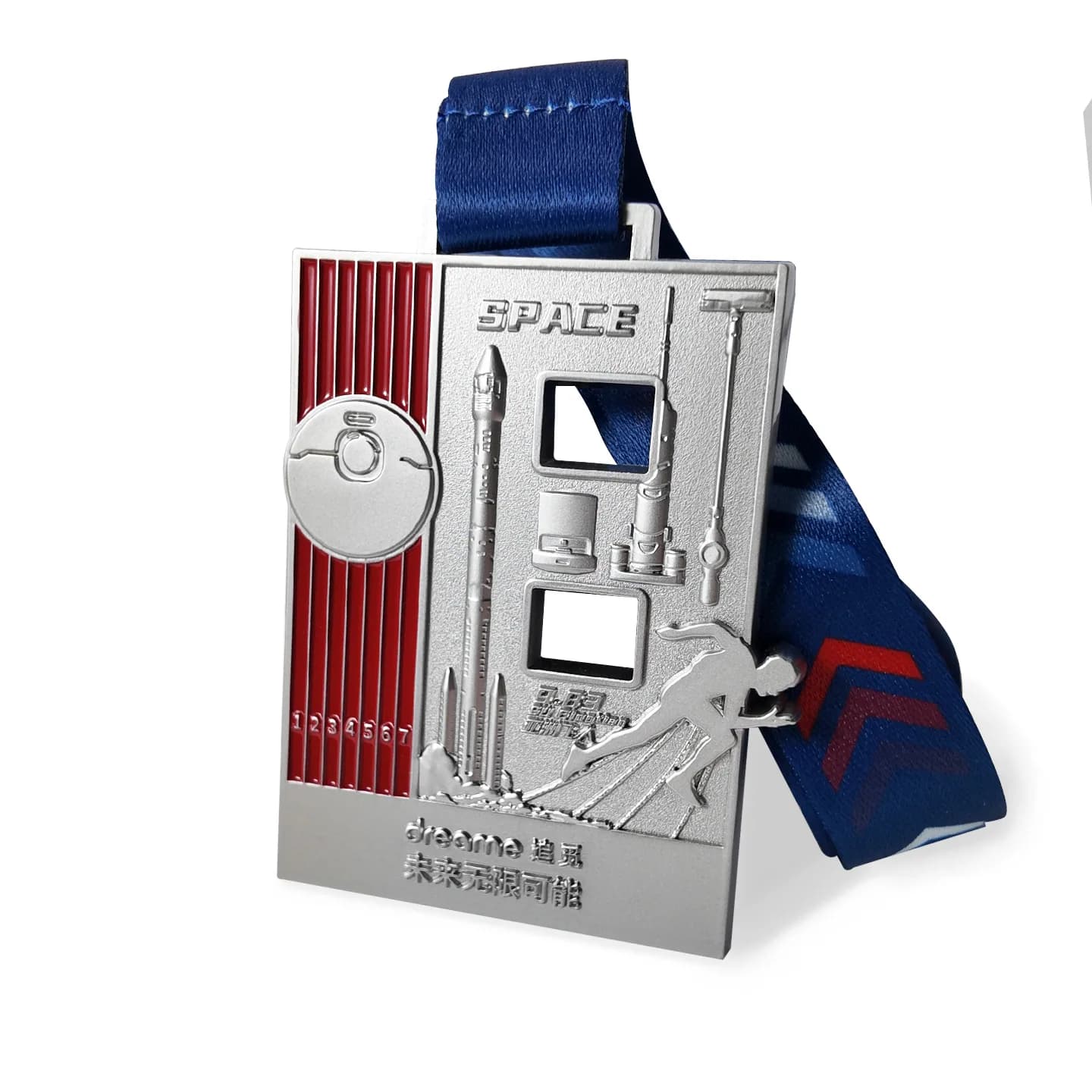
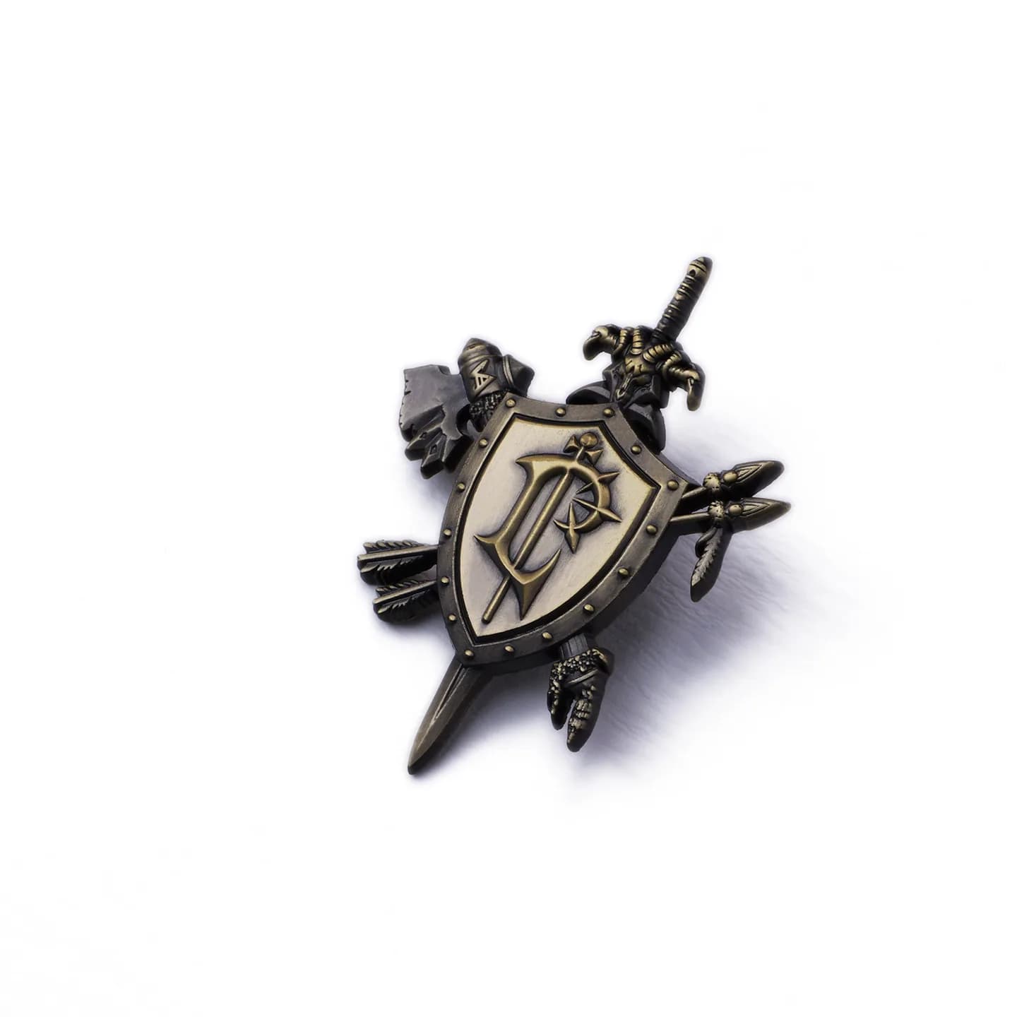
A useful reference is the kind of relief work that already carries text well. The 90 mm zinc-alloy event commemorative medals combine relief engraving, openwork, and electroplating, and at that size there is genuine room to set a name and date into the composition rather than around it. Smaller pieces are less forgiving: the 45 mm vintage 3D embossed metal badge shows how embossing and electroplating build texture on a compact face, and on a piece that size the personalization has to be planned as part of the relief, not added as an afterthought. Neither example tells you what your own layout will hold, but they show why size and process decide the answer before wording does.
The material underneath matters too, because it governs how fine the lettering can go and how it will age. Zinc alloy casts detail well and takes plating cleanly, which is why it is common for commemorative pieces; brass and other metals behave differently in the same hands. If durability over years of handling is part of the brief, it is worth reading our comparison of metals for durable souvenirs before finalizing the lettering style, since a soft surface and a fine engraved line are not always a good match.
Before anything goes to tooling, the things worth confirming are simple: the exact spelling of every name, the date format and which date it represents, whether personalization is identical across the run or varies per piece, and which face carries it. A proof of the layout at actual size is the only reliable way to judge whether the text still reads clearly next to the relief, and a physical sample is what tells you how the lettering catches light and feels in the hand. Approving a sample confirms that one piece, not the whole run, so it is reasonable to ask how the text will be held consistent across the quantity you order. Get those points settled and the personalization stops being a last-minute addition and becomes part of the design.